
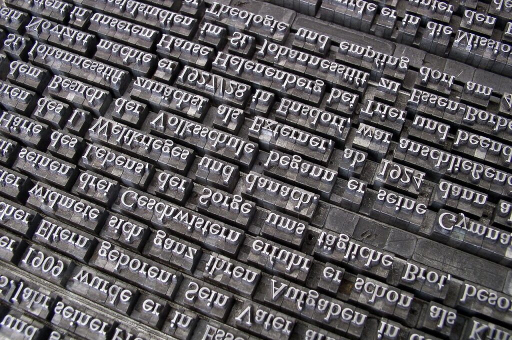
The International Typographic Style, better known as Swiss design, was built for posters and books. Its rules, a grid, a clear typographic hierarchy, left-aligned text and nothing decorative, solve exactly the problems most business websites have. Here is where it came from and how to use it on a website, with a grid you can try yourself.
Swiss design, or the International Typographic Style, emerged in Zurich and Basel in the 1950s. Its core is a grid that gives every element a place, a clear typographic hierarchy, flush-left text with a ragged right edge, generous white space, sans-serif type and objective imagery. On a website these rules translate into layouts that load fast, scan easily, work on phones and stay readable for everyone.
For a business website the point isn’t to look like a 1960s poster. It’s to borrow the discipline: fewer elements, each with a reason, arranged so the visitor finds what they came for without thinking.
Where Swiss design came from
The style grew out of the modernist ideas of the 1920s, but it took its recognisable form in Switzerland after the Second World War. Two schools carried it. In Zurich, designers around Josef Müller-Brockmann worked on posters and corporate design with strict grids and objective photography. In Basel, Emil Ruder and Armin Hofmann taught typography and form at the School of Design, where generations of designers learned to treat type as structure rather than decoration.
The journal Neue Grafik, published in Zurich from 1958 to 1965, spread the approach internationally. Ruder’s book Typographie appeared in 1967, and Müller-Brockmann’s Grid Systems in Graphic Design in 1981. Both are still in print and still read by designers, which says something about how well the ideas have aged.
Armin Hofmann’s Graphic Design Manual from 1965 is the third classic. It reads less like a rulebook and more like a course in seeing: how a dot, a line and a letter interact on a surface. That’s worth remembering when “Swiss design” gets reduced to a font and a red accent. The designers themselves cared far more about the method than about any particular look, and the method is what transfers to websites.
| Year | Milestone |
|---|---|
| 1957 | Neue Haas Grotesk, later renamed Helvetica, is released by the Haas Type Foundry near Basel, designed by Max Miedinger with Eduard Hoffmann. |
| 1957 | Univers by Adrian Frutiger is released, a sans-serif family planned as a system of weights and widths. |
| 1958–1965 | Neue Grafik is published in Zurich and makes the style known internationally. |
| 1967 | Emil Ruder publishes Typographie. |
| 1981 | Josef Müller-Brockmann publishes Grid Systems in Graphic Design. |
A short selection, not a complete history.
The six principles, and what each means on a website
| Principle | In print | On a website |
|---|---|---|
| The grid | Columns and rows that every element aligns to | A consistent column system that reflows from desktop to phone |
| Typographic hierarchy | Size and weight show what matters | One H1, clear H2s, readable body text; scanning works without reading everything |
| Flush-left text | Left-aligned with a ragged right edge, no forced justification | Even spacing between words, easier reading, better for people with dyslexia |
| White space | Empty space as an active element | Room around buttons and blocks so each one is clearly separate |
| Objective imagery | Photography instead of illustration that tells a story | Real photos of your team, work and premises instead of stock |
| Reduction | Nothing without a function | No sliders, no decorative animations, no elements that only “look nice” |
Notice how closely the right-hand column matches what web accessibility and SEO guidelines recommend. Clear headings help screen readers and search engines. Left-aligned text with comfortable line length helps everyone read. Fewer elements mean faster pages. The Swiss designers weren’t thinking about Google, but they were solving the same problem: getting information to people quickly and without misunderstanding.
Try it: one layout, three grids
Switch between the column counts to see how the same content sits on different grids. Notice how the blocks always align to column edges, which is what makes a grid-based page feel calm even when the layout is asymmetric.
12 columns: the classic web grid. Divisible by 2, 3, 4 and 6, so it allows halves, thirds and quarters.
Typography: the numbers that make text readable
Swiss typographers were precise about measures, and many of their rules survive as practical guidance for screens. The most useful is line length. Robert Bringhurst's widely used reference, The Elements of Typographic Style, puts a comfortable line at roughly 45 to 75 characters, with about 66 as an ideal for a single column of body text. Lines much longer than that make the eye lose its place; much shorter ones break the rhythm.
Characters per line
Comfortable range for body text in one column
Ranges after Bringhurst, The Elements of Typographic Style. On screens, a max-width of about 65–70 characters (around 35–40 em) works well.
Three more rules carry over well. Use a limited number of sizes, three or four, with clear steps between them. Set body text at a size that's comfortable on a phone without zooming, typically 16 to 18 pixels. And give lines enough height, around 1.5 times the font size for body text, so paragraphs breathe. German text needs a little extra care: long compound words like "Hauptversammlungsprotokoll" break narrow columns, so test headings on a phone and enable hyphenation where it helps.
Helvetica, and what to use on the web instead
Helvetica is the font most associated with Swiss design, but on the web it's rarely the right choice. It's installed on Apple devices and not on most Windows and Android systems, so visitors see different fallbacks. Licensing a web version costs money, and its closely spaced letters aren't the most legible at small sizes on screens. The spirit of Swiss design is clarity, not a particular typeface.
| Option | Why it fits | Watch out for |
|---|---|---|
| System font stack | No download, instant rendering, native look on every device | Looks slightly different per platform |
| A neo-grotesque web font | Close to the Swiss look, consistent everywhere | Load it locally, not from a third-party server, for privacy and speed |
| A humanist sans-serif | Very legible at small sizes on screens | Less "Swiss", more friendly in tone |
Whatever you choose, host font files on your own server. Loading them from an external provider sends each visitor's IP address to that provider, which needs to be covered in your privacy policy under the revised Swiss Data Protection Act and slows the first render.
Colour: restraint, and contrast that works
Classic Swiss posters often used black, white and one strong accent, frequently red. That restraint translates well to the web: a neutral base, one brand colour for actions and highlights, and a second colour at most. The modern addition is contrast. Text needs a ratio of at least 4.5:1 against its background, and the brand colour that looks great as a background can make dark headings unreadable on top of it. Check every combination you actually use, not just the main one. Our accessibility guide shows measured ratios for real colour pairs.
Applying Swiss design to an SME website
| Page element | Swiss approach |
|---|---|
| First screen | One clear statement of what you do, one action, nothing else competing for attention. |
| Navigation | Five or six items at most, named in plain words. |
| Service overview | Equal blocks on the grid, each with a title, one sentence and a link. |
| Tables | Left-aligned text, thin 1px rules, no zebra stripes or heavy colours, numbers right where they're comparable. |
| Images | Real photos, consistently cropped to the grid, no decorative stock. |
| Footer | Contact, address, legal links. Not a second sitemap. |
The tables on this page follow exactly that rule: left-aligned, thin borders, no decoration. It's a small detail that makes a page feel orderly, and it's typical of the style.
Building a Swiss grid in CSS
Müller-Brockmann planned his grids on paper with a ruler. On the web, CSS Grid does the same job and is supported by every current browser. A good web grid is defined by four decisions, and once they're made, every page of the site follows them without anyone having to think about alignment again.
| Decision | Typical value | Why |
|---|---|---|
| Maximum content width | 1,140–1,280 px | Keeps lines and blocks from stretching on large monitors |
| Columns | 12 / 8 / 4 (desktop / tablet / phone) | Each count divides cleanly into common block widths |
| Gutter | 16–32 px, growing with screen width | Separates blocks without breaking them apart visually |
| Spacing unit | 8 px, used in multiples | Vertical rhythm: every margin is 8, 16, 24, 32 or 48 px, never a random 13 |
The spacing unit is the part most often forgotten. Swiss posters feel calm because the vertical distances repeat as much as the horizontal ones. On a website, deciding that every gap is a multiple of one base value removes dozens of small inconsistencies that visitors never consciously notice but still register as "slightly messy". In WordPress themes the same values belong in the global settings, so editors can't accidentally introduce a new spacing on a single page.
One practical tip: plan the grid from the phone up. Start with four columns and decide what each block looks like at full width, then let blocks sit side by side as space grows. Designing the desktop first and squeezing it afterwards is how most "grid on desktop only" problems start.
Swiss design compared with other web styles
| Style | Main idea | Good for | Risk for an SME site |
|---|---|---|---|
| Swiss / International | Grid, hierarchy, reduction | Service businesses, B2B, professions | Can feel cold without real photos |
| Flat design | No shadows or textures, simple shapes | Apps and product interfaces | Buttons that don't look clickable |
| Brutalism | Raw, deliberately unpolished layouts | Art, culture, portfolios | Confuses visitors who just want a phone number |
| Maximalism | Bold colour, many layers, big type | Fashion, events, entertainment | Slow pages and weak contrast |
These styles aren't mutually exclusive. Many good sites use a Swiss grid and hierarchy as the skeleton and add warmth through photography, a friendly typeface or one expressive brand colour. The grid is what keeps the expressive parts from turning into chaos.
Swiss design on a multilingual website
Swiss designers worked in a country with several languages, and a grid is partly an answer to that: the structure stays the same while the text changes. On a website the same applies, with one caution. German and French versions of a text often run noticeably longer than the English one, and German compounds can't be broken anywhere you like. A button that fits "Contact us" may not fit "Kontaktieren Sie uns". Design with the longest language, not the shortest, and test every template in each language before launch. Our multilingual SEO guide covers the technical side of running several language versions.
How Swiss is your website? A one-minute check
Tick what's already true for your site.
When "Swiss style" goes wrong
Minimal but empty. Reduction means removing what doesn't help, not removing information. A homepage with a huge headline and nothing else isn't Swiss, it's unfinished.
Grey on grey. Light grey text on white looks elegant in a design file and fails contrast on a phone in the sun.
Tiny type. Small, wide-spaced capitals look sophisticated and are hard to read. Body text belongs at a comfortable size.
A grid on desktop only. If the grid collapses into a random stack on the phone, most visitors never see it. Plan the mobile grid first.
Style over content. The original designers started with the content and built the layout around it. Starting with a fashionable template and pouring text into it is the opposite.
Why it pays off for a business
Clarity isn't just an aesthetic preference. A page where the visitor understands within seconds what you offer and what to do next converts more of its visitors into enquiries. Fewer elements mean faster loading, which matters on mobile data. Clear headings and left-aligned text make the content easier for search engines and AI systems to parse. And a calm, consistent layout signals the reliability that Swiss customers expect from a Swiss business. The principles of turning that clarity into enquiries are covered in our guide to UX principles.
How we build: every website in our website subscription starts from a grid, a limited type scale, left-aligned text and real images where the client has them. We keep the number of fonts, scripts and plugins as low as the site allows, which is reduction applied to code: what the visitor never sees still affects how fast the page appears.
Swiss design FAQ
What is Swiss design?
A graphic design approach from Zurich and Basel in the 1950s, also called the International Typographic Style. It relies on grids, clear typographic hierarchy, flush-left sans-serif type, white space and objective imagery.
Who were the key Swiss designers?
Among the best known are Josef Müller-Brockmann in Zurich and Emil Ruder and Armin Hofmann in Basel. Max Miedinger designed Neue Haas Grotesk, later Helvetica, and Adrian Frutiger designed Univers.
How many columns should a website grid have?
Twelve on desktop is the common choice because it divides into halves, thirds and quarters. Tablets often use eight and phones four.
Should my website use Helvetica?
Not necessarily. It isn't installed on most Windows and Android devices. A system font stack or a locally hosted sans-serif web font serves the same purpose more reliably.
How long should a line of text be?
About 45 to 75 characters, with around 66 as a comfortable ideal for body text.
Want a website with Swiss clarity?
In a free 30-minute call we look at your current site through this lens and show you what to remove, what to keep and what to make clearer. Or email us: order@cleardesign.ch

